Earlier this year I got pretty excited about homelabs, running my own server at home, and generally moving more of my digital life onto infrastructure I control.
Somewhere between setting up email, file hosting and a bunch of other services, I thought: why don’t I finally build my own website as well?
Maybe start blogging. Share some projects. Put a few things on the internet that aren’t living inside somebody else’s platform.
AI makes that super simple now, right?
A beautiful website is just a few prompts away!
Well. Turns out it took me seven months.
Not seven months of continuous work, obviously. More like seven months of coming back to it, making something, deciding I didn’t like it, abandoning it for a while, and then trying again.
Eventually I landed on something I actually wanted to keep.
So here’s how the site got here.
The posts themselves are still the part I never find time for. Great start.
The concept
I’m running a startup, I love technology, and I spend a good chunk of my free time trying to become a better technical diver.
So the original plan was pretty obvious: split the site into those three areas and launch it with a few posts for each.
Yep, that didn’t happen.
Turns out creating content is quite hard when you already have a full-time+ job and hobbies that are specifically designed to get you away from a screen.
That didn’t stop me from endlessly iterating on the structure and design, though.
I started with the visuals for those three sections.
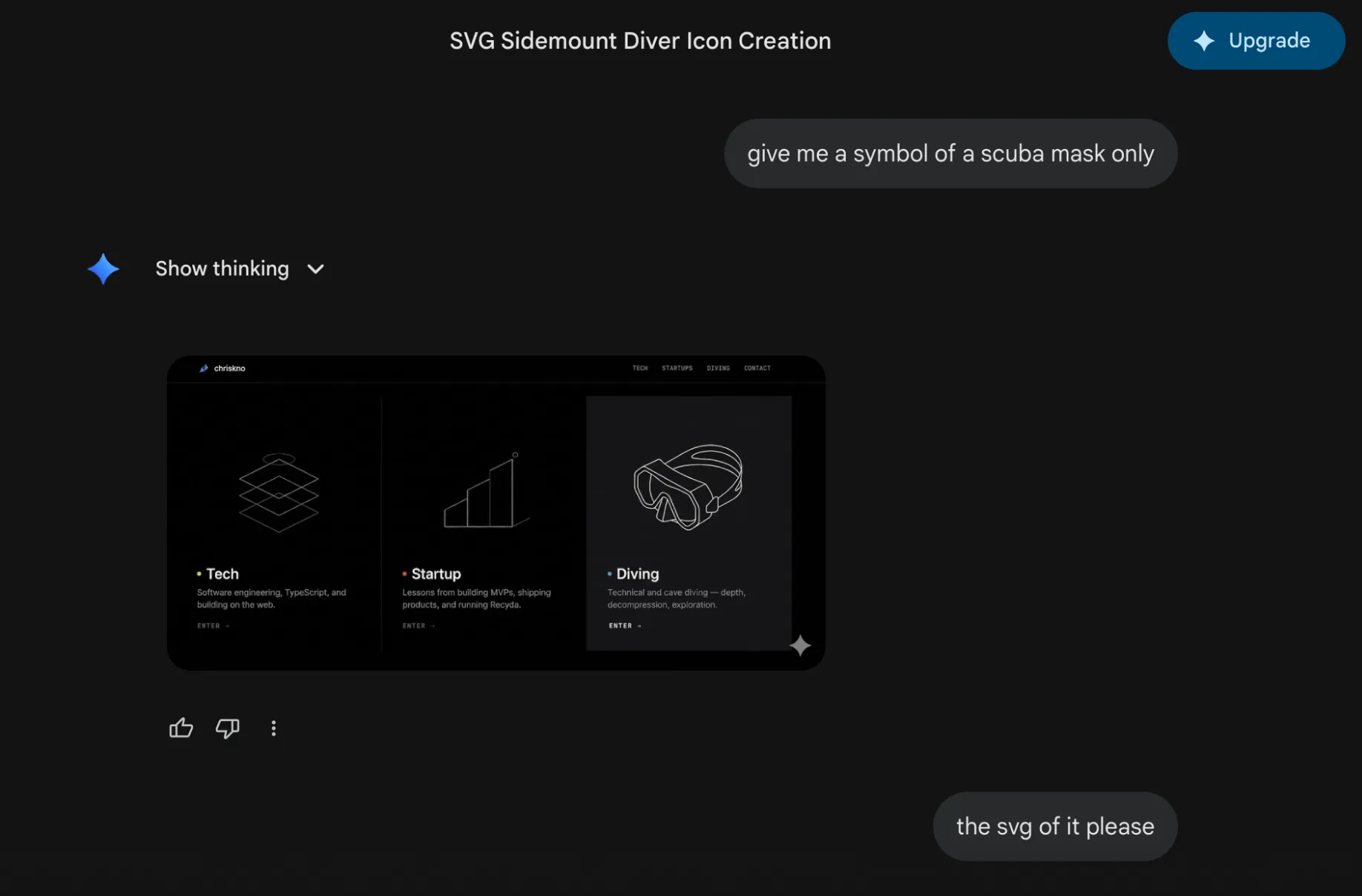
Great rendering of a scuba mask, Gemini. Now please give me that as an SVG 🤓
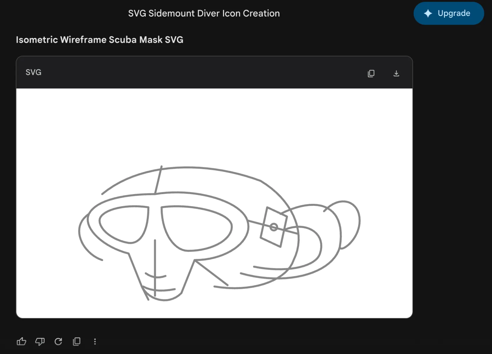
Great looking mask SVG 👁️👄👁️
Turns out Gemini 3.1 Pro is not particularly good at creating SVG scuba masks.
The three columns did become a homepage draft.
The mask did not.
The ugly drafts
I chose Astro as the framework for the site and, realistically, I could have stopped right there.
Something minimal like Astro Nano would have been a great choice.
But no.
I wanted to make it “fancy”.
So over the next few months I produced this:
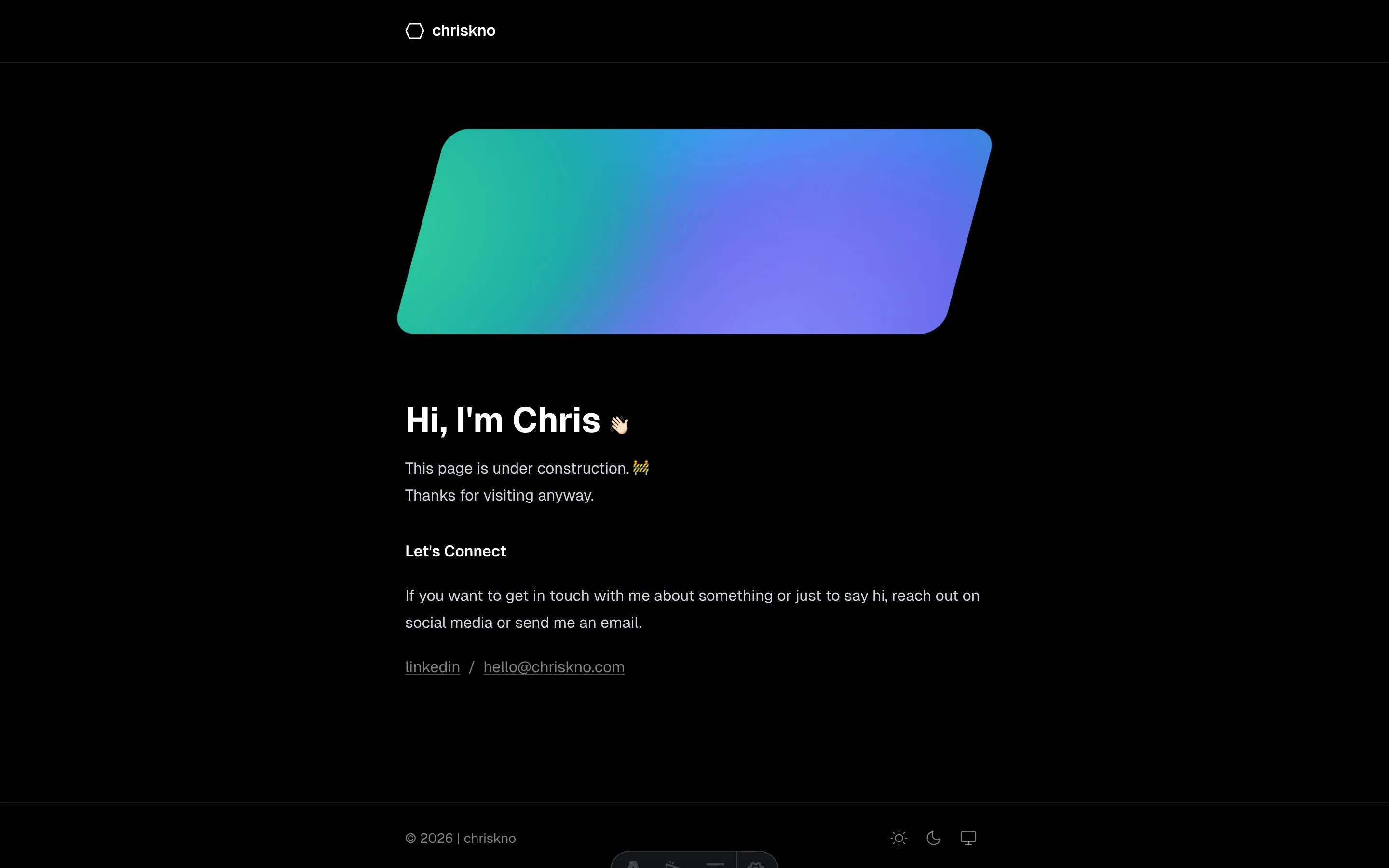
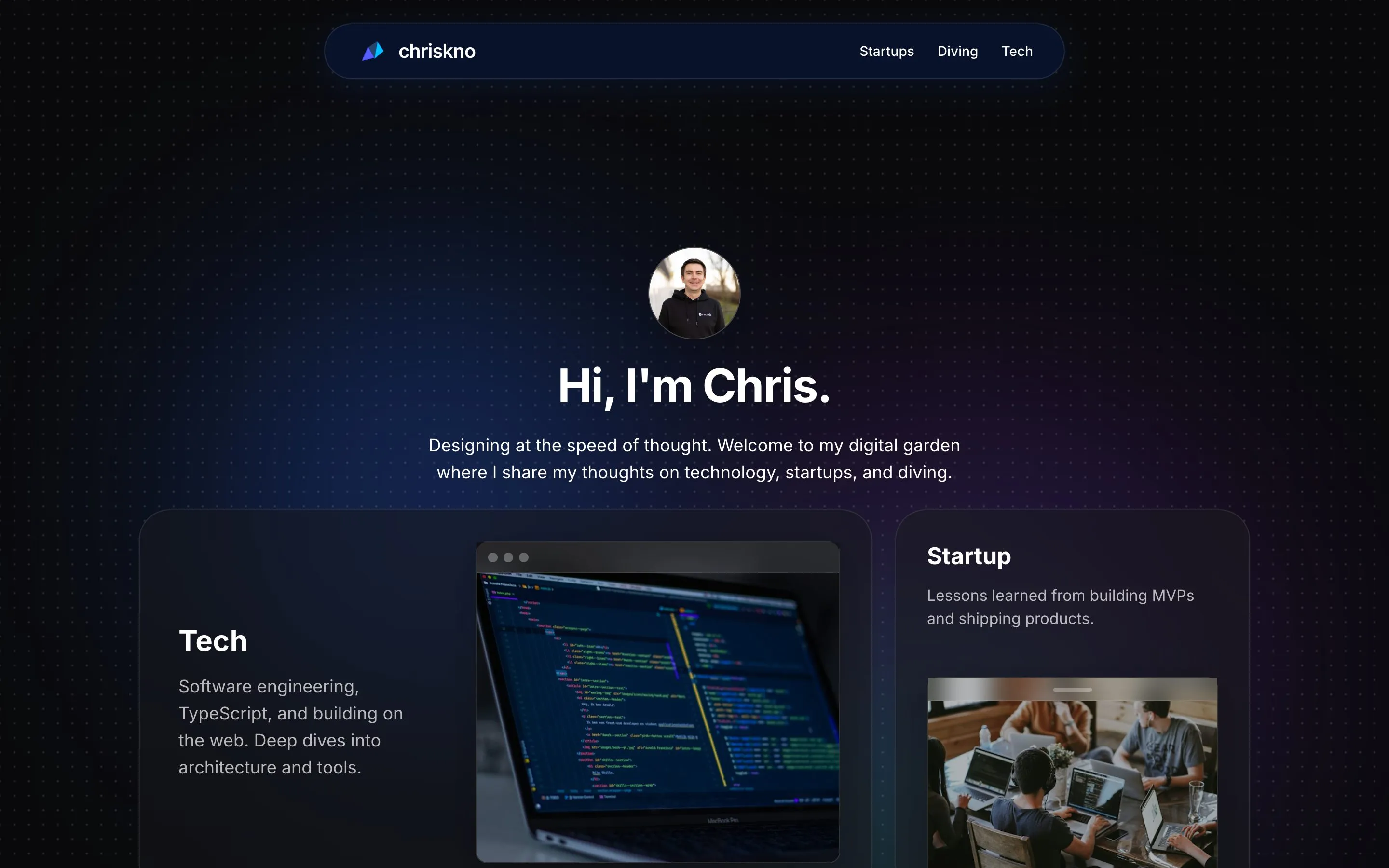
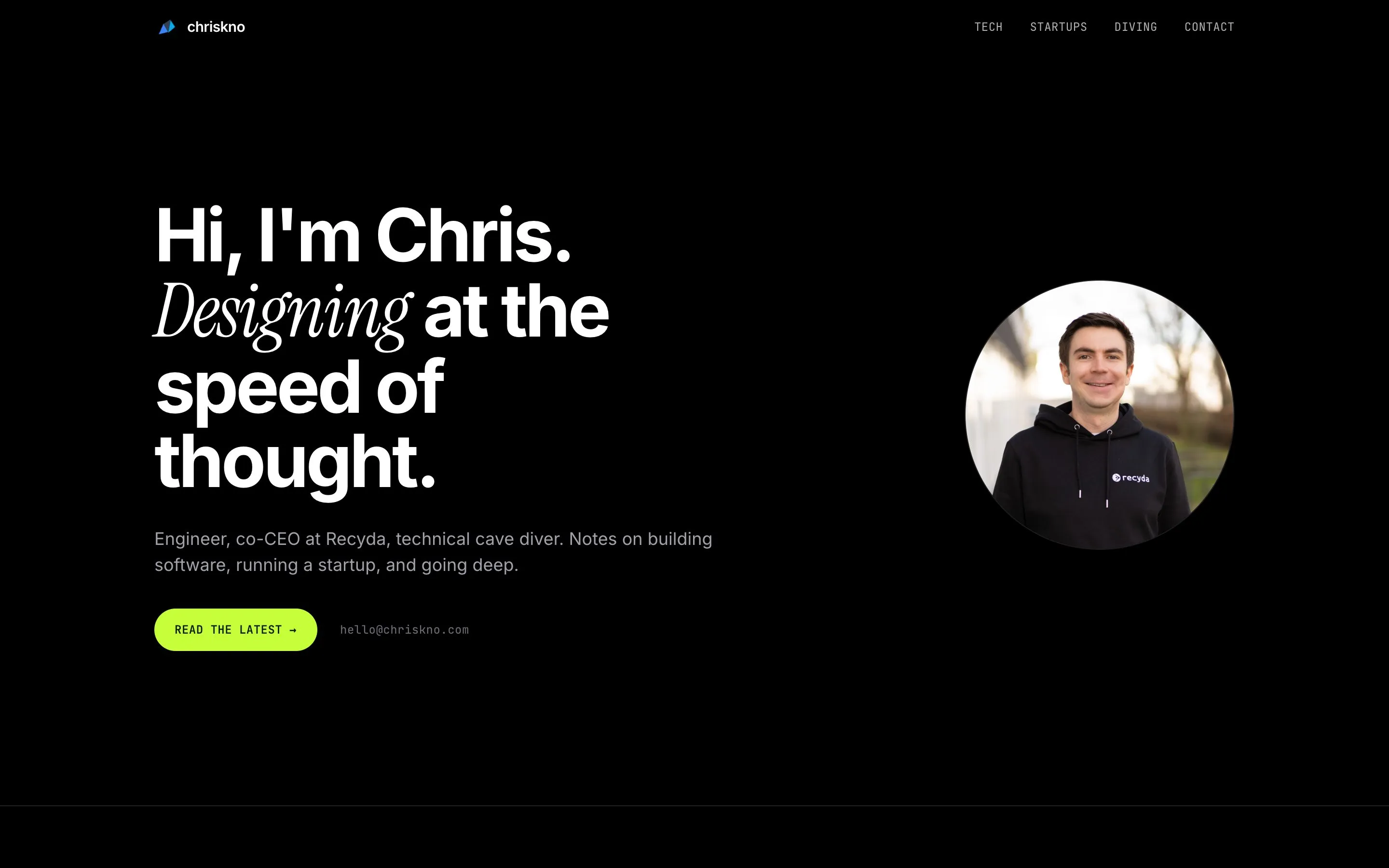
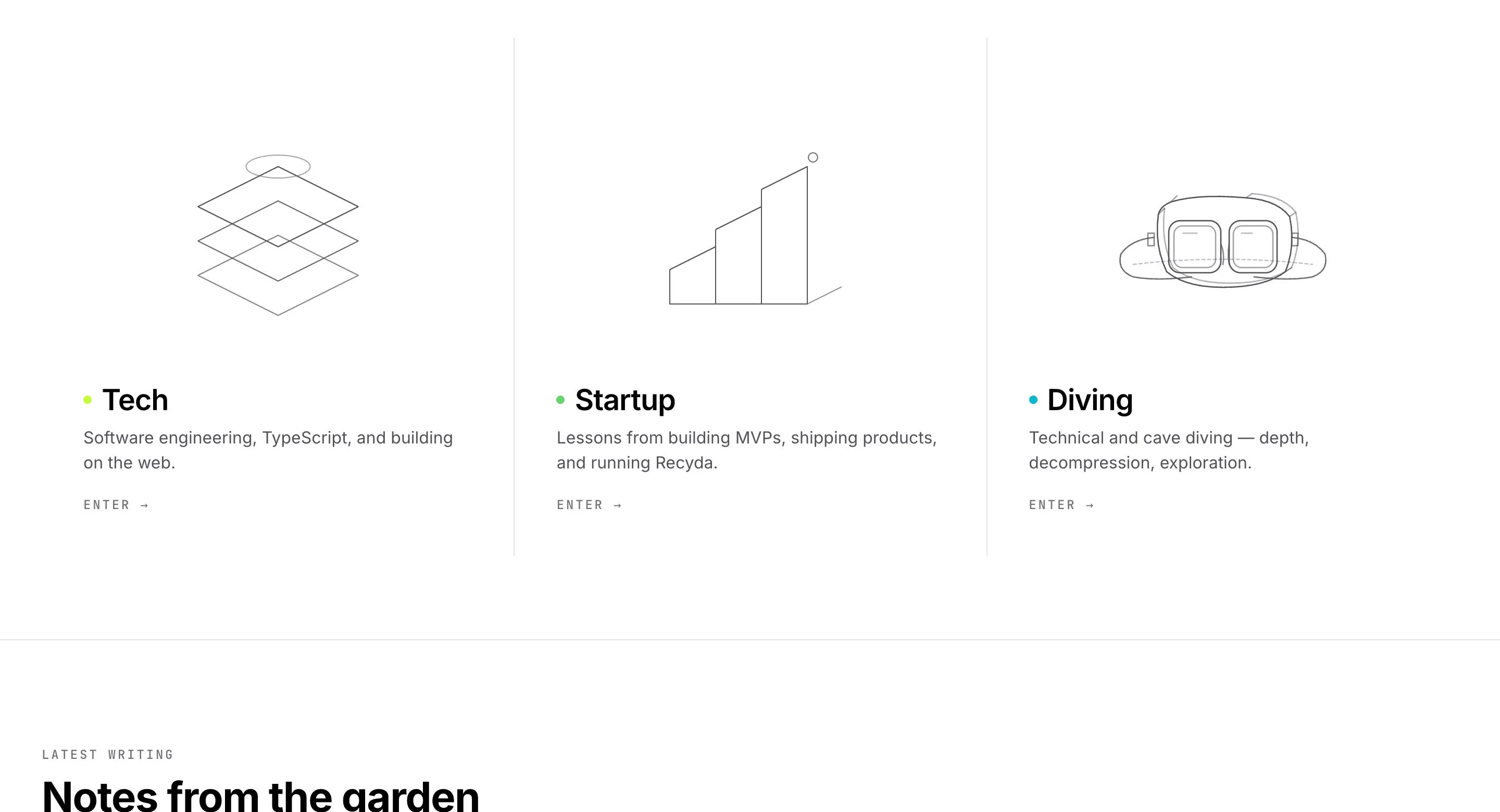
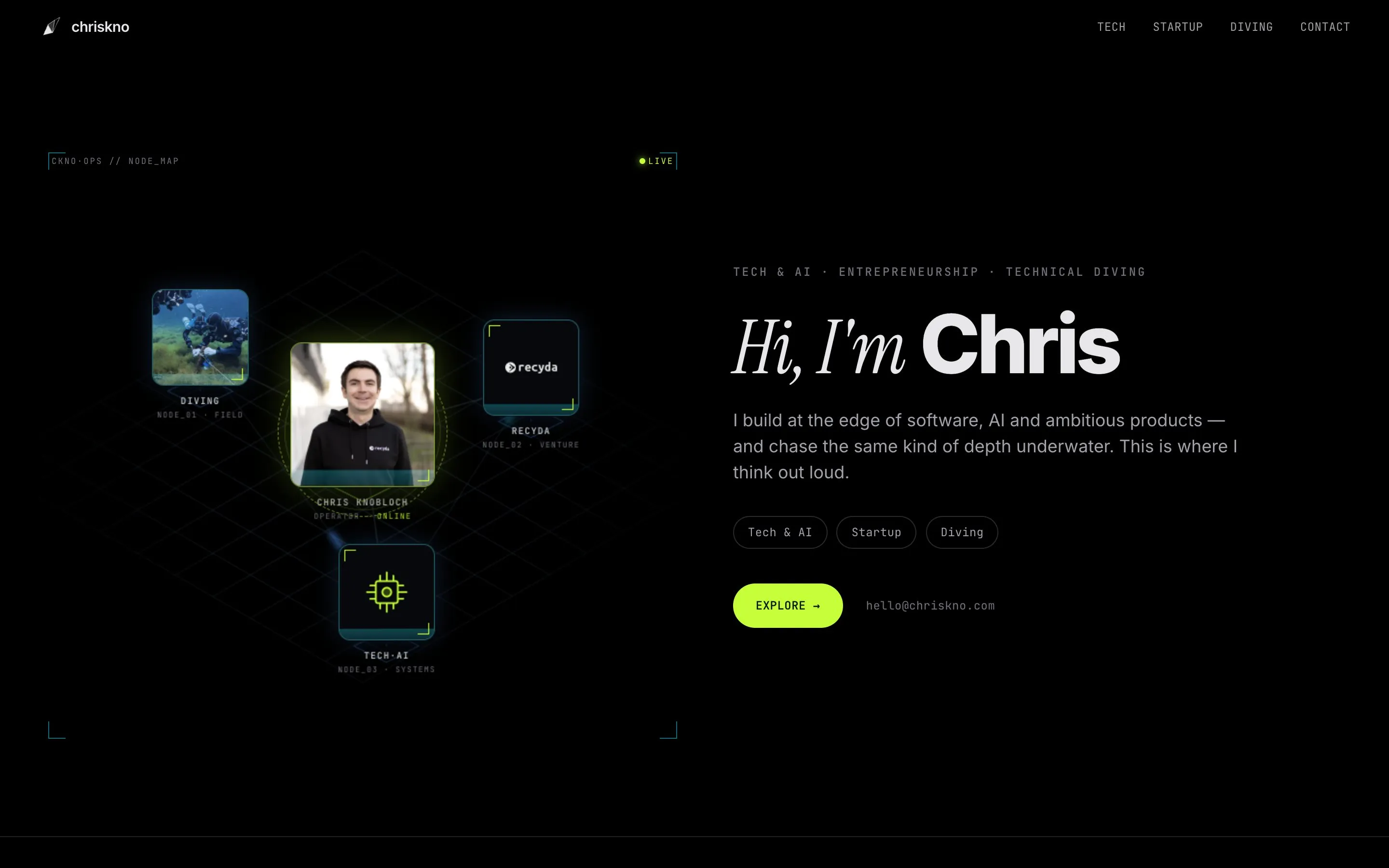
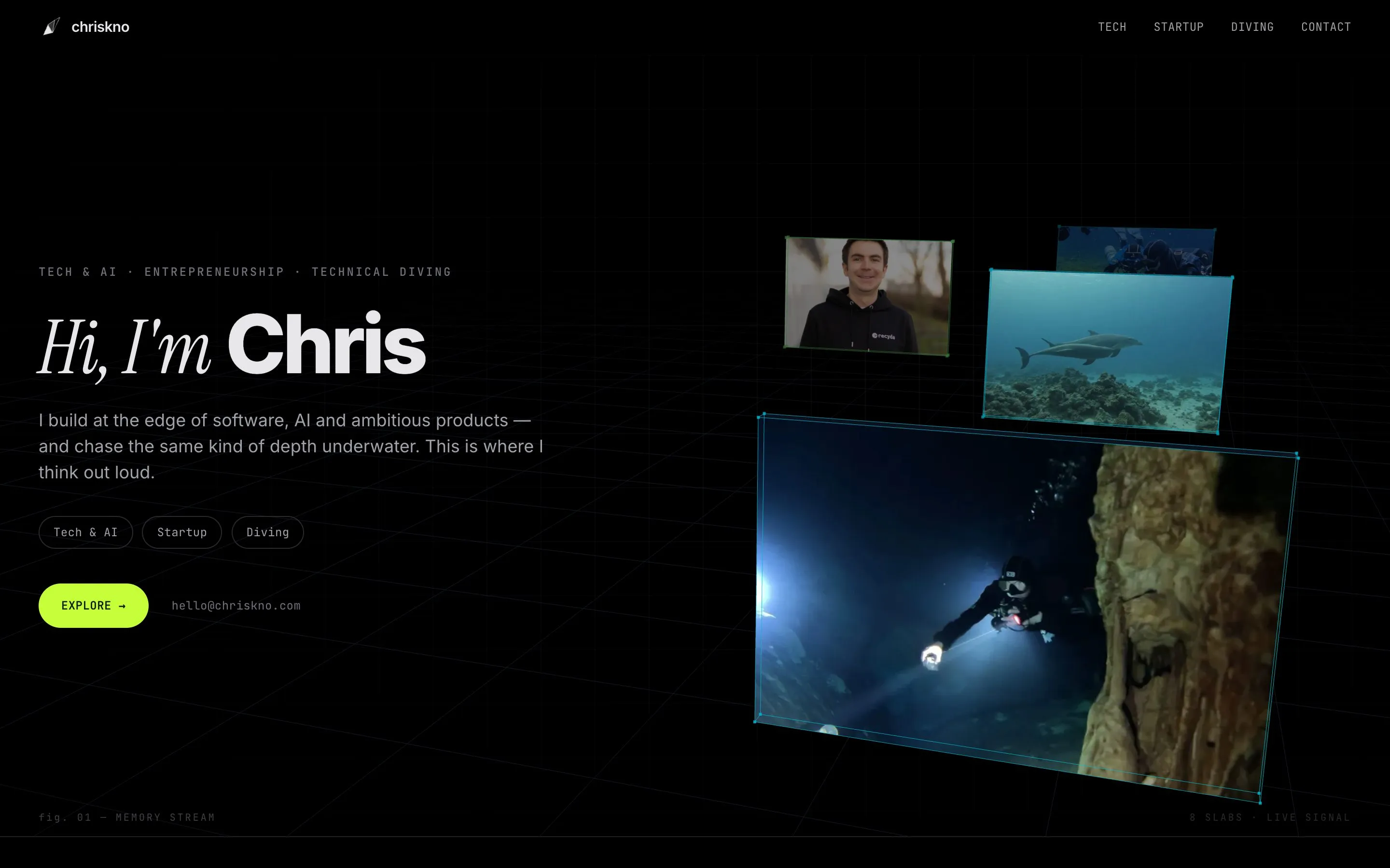
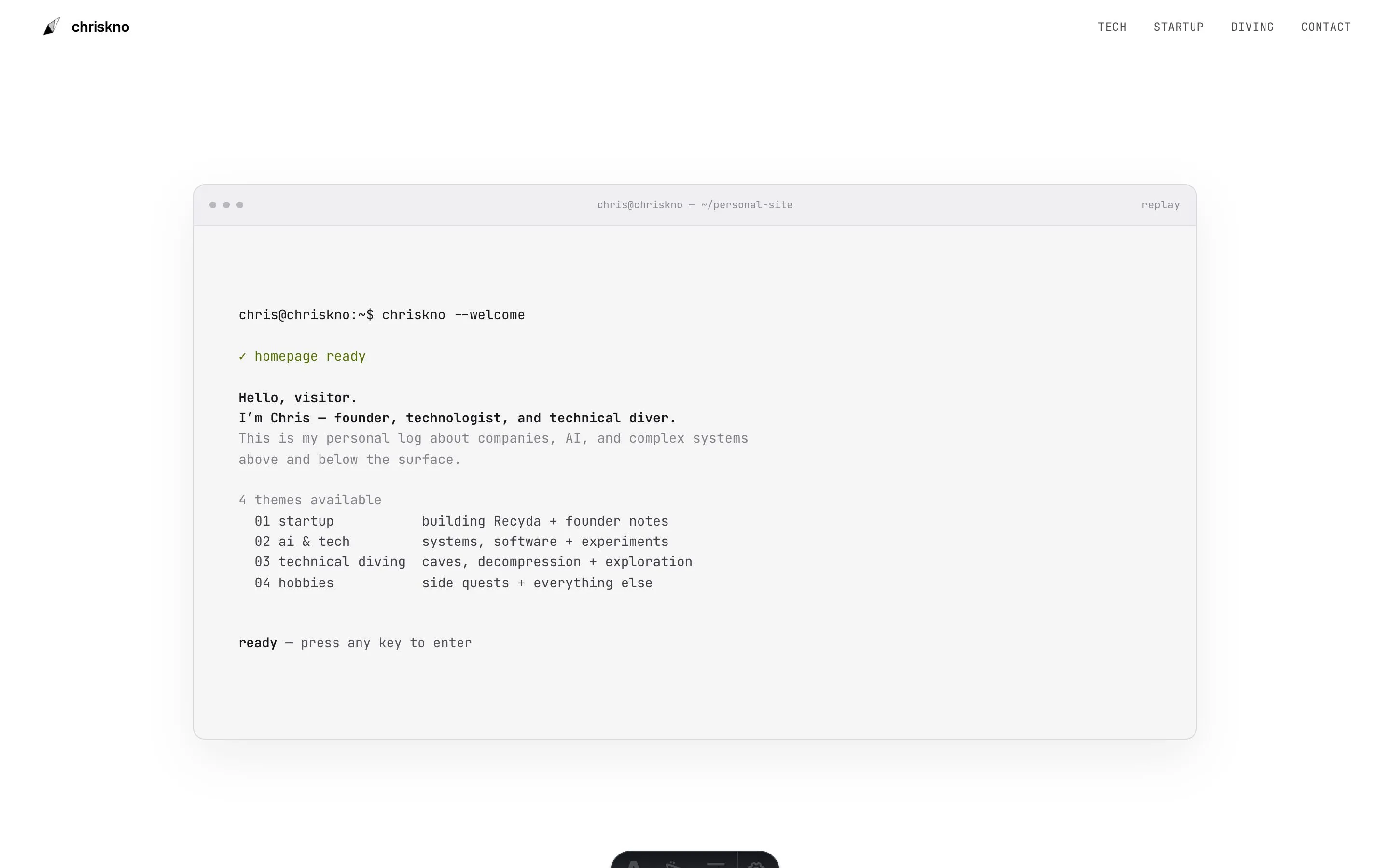
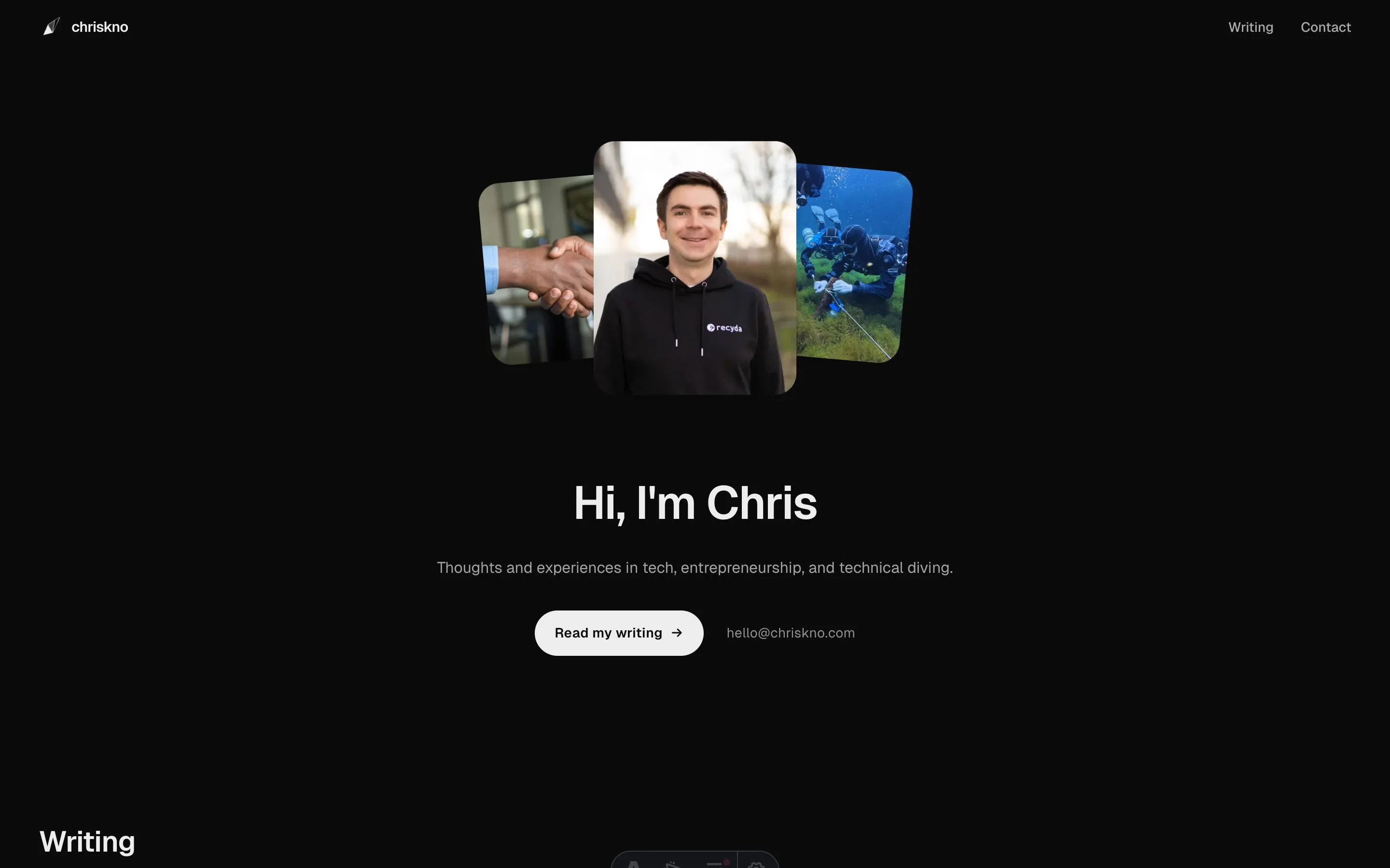
There were good ideas in some of them, but none felt like a place I wanted to keep building on.
That became the real problem.
AI could generate endless variations. What it couldn’t do for me was decide which direction was actually worth following.
Okay, this one might work
Claude Opus 5.5 had just come out, so naturally I wanted to see what it would do with the site.
A while earlier I’d found two websites I really liked: Logartis and Nikunj Kothari.
That got me thinking less about layouts and more about place.
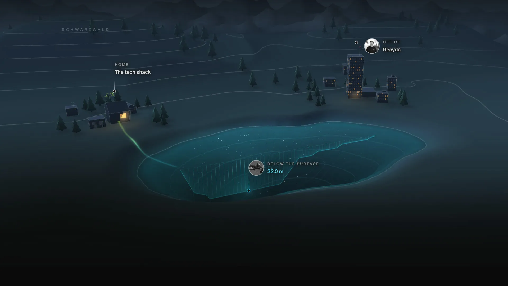
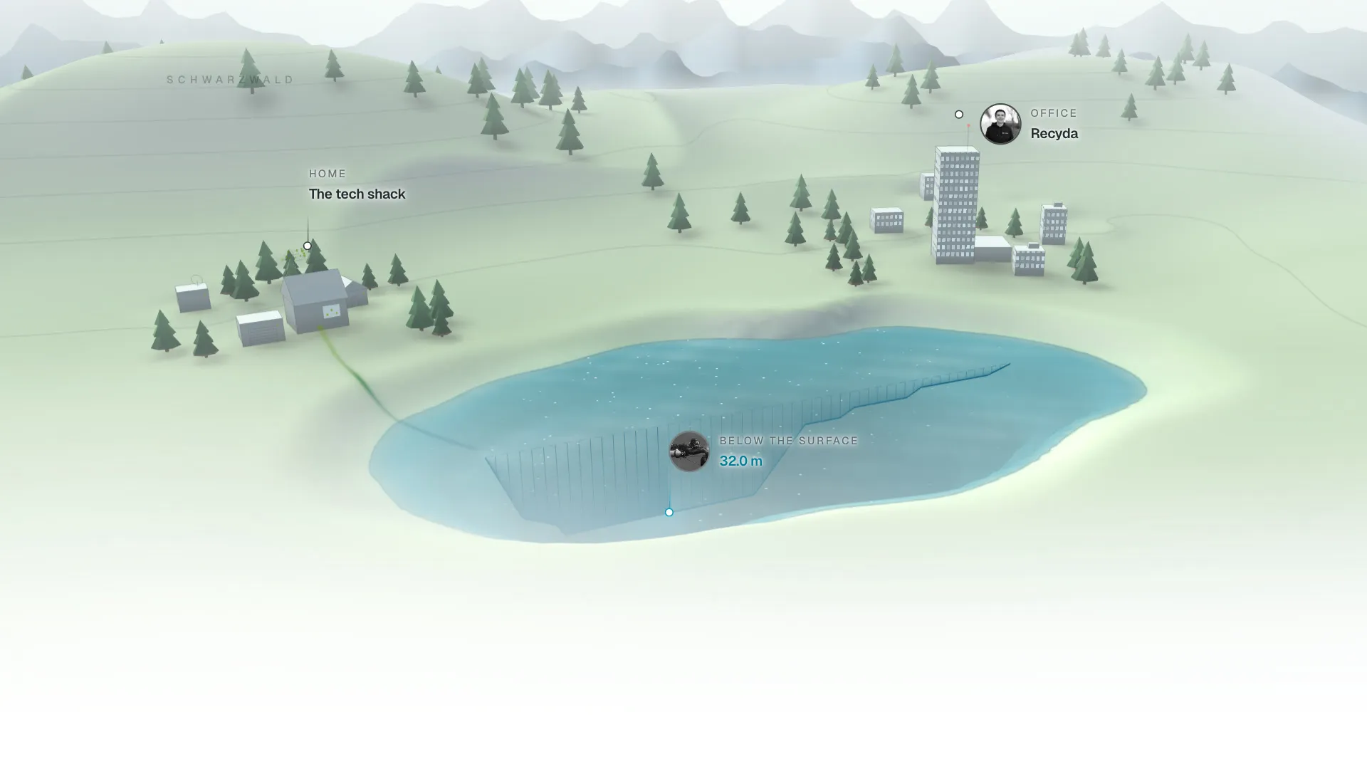
I live in the Black Forest, work in Freiburg, and do much of my diving in lakes nearby. Maybe the homepage could somehow represent all of that as one little world: terrain, contours, water and a few buildings.
Something somewhere between a map and a wireframe.
So I tried turning the idea into a reference image with BFL’s FLUX model:
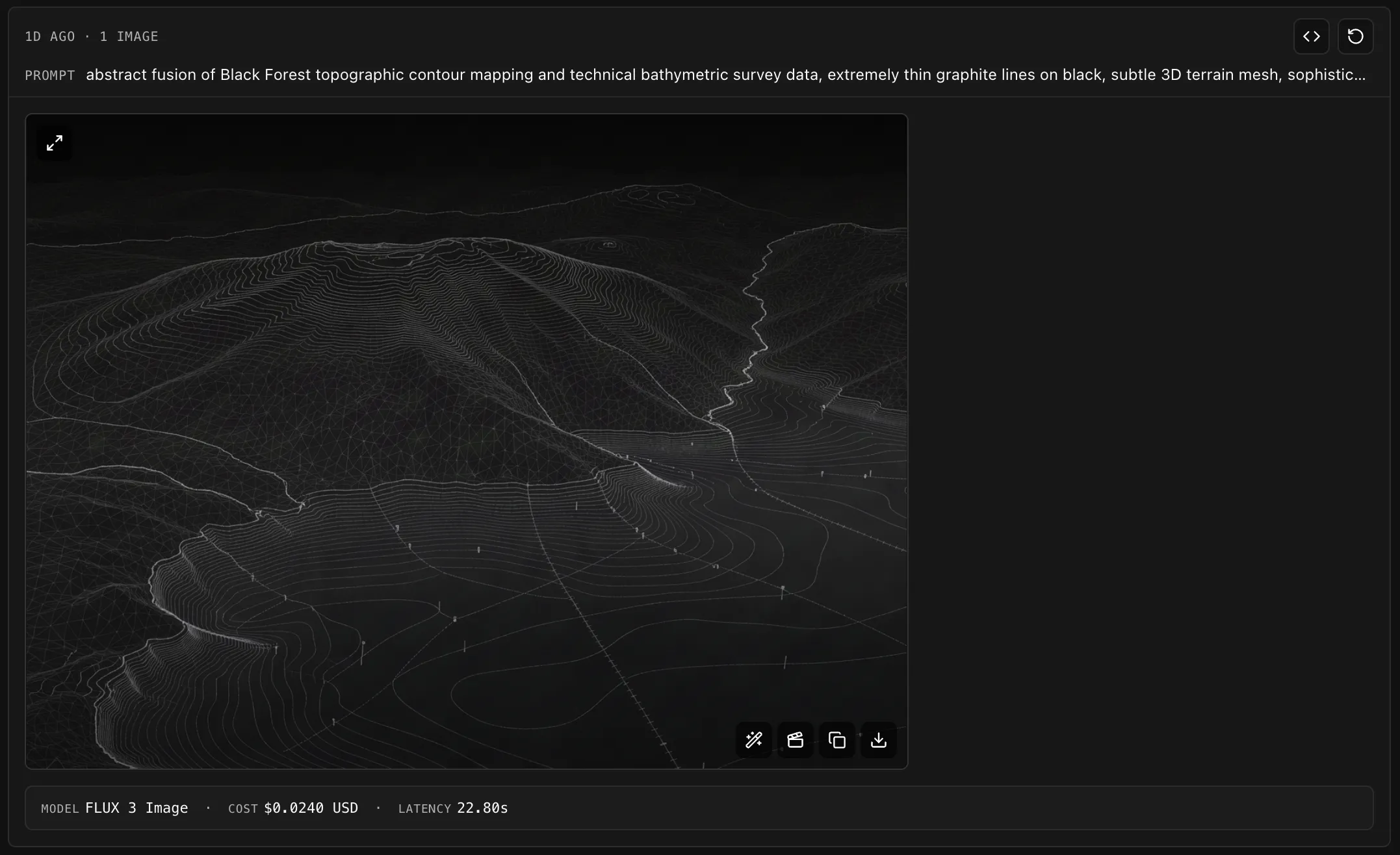
Probably not a showcase piece for BFL, but it did the job. Also, I prompted the prompt that generated this, so I probably could’ve skipped a step.
I gave Claude that image together with the two websites.
What came back was basically the drawing turned into a small 3D world: hills, a lake made from contour rings, a house, an office and even a diver underneath the surface.
For the first time, the site wasn’t just a layout.
It connected the three things I actually wanted it to be about.
Home in the Black Forest. Work in Freiburg. Diving somewhere below the waterline.
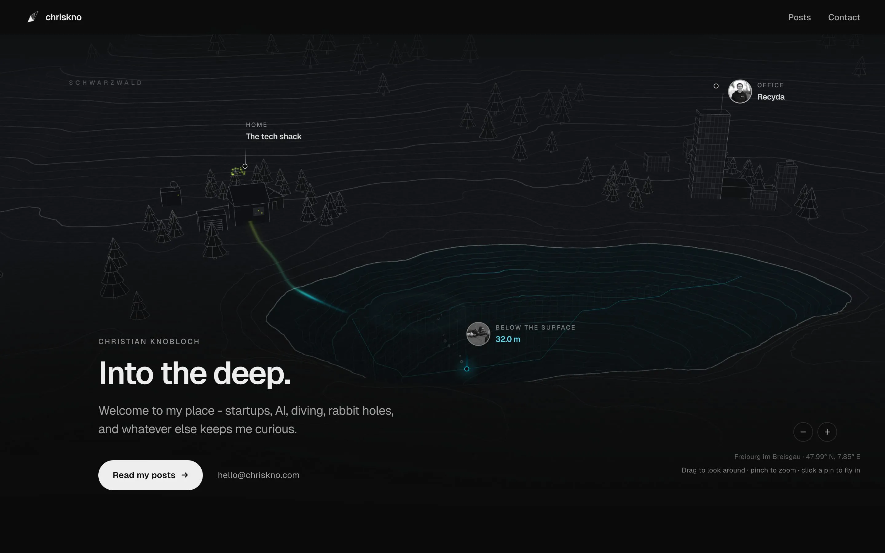
The first world. Still a mesh.
From there, something changed.
Instead of asking AI to invent another homepage, I could ask it to improve this one.
Keep the world, but calm it down.
Fewer lines. Sparse trees. Warm windows. A glowing lake. More detail around the cursor. The same place working during both the day and at night.
And Claude was surprisingly good at staying inside the idea instead of reinventing everything whenever I asked for a change.
Once that foundation existed, iteration became much easier.
I could point at a screenshot and say: that tree is growing through the label. The camera ends too high. The lake disappears. The daytime version looks like summer Minecraft.
Then fix one thing without the rest falling apart.
Most of the remaining work was basically that: one complaint at a time.
Daylight was probably the hardest part.
Dark green hills looked too much like a summer illustration. Make them too pale and the whole scene washed out. Brown worked technically, but felt like a completely different place.
What finally stayed was closer to stone in sunlight, with some green in the shadows and the lake providing the one deep colour.
I wanted it to work on a bright phone screen without locking the Black Forest into one particular season.
The mark
By that point, the diamond/facets logo I’d been using didn’t really belong to the site anymore.
The original idea was to represent the different {tech, startup, diving} facets with different colours.
It made sense in my head.
It was also not very good.
The homepage had become this little landscape, so I wanted the mark to come from the same place: mountain above, lake below.
Simple geometry. Slightly plastic in colour. Still readable when it’s tiny enough to be a favicon.
I also wanted the name itself to move.
It starts as christianknobloch, then the letters gradually step away until chriskno is left — the name the site runs on.
The shape reads from left to right as well.
A smaller peak comes first, followed by a higher one.
I like that as a small representation of progress: you get over one ridge, and then there’s another one behind it.
Below the waterline, the shape continues downward, with the deepest point right underneath the summit.
That’s the lake, but it also fits my tendency to want to know what’s underneath things — whether that’s a cave, a codebase or a company.
Taken together, the outline also leans slightly toward a heart.
That wasn’t intentional, but Claude pointed it out and I kept it.
It fits.
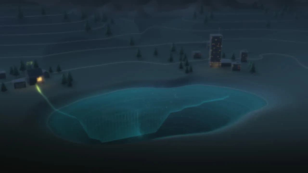
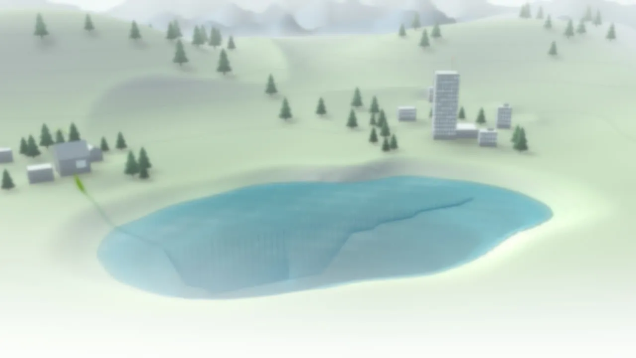
At night, the header uses the monochrome version. During the day, it gets the full treatment: green for the climb, blue for the water.
And this is where it landed:
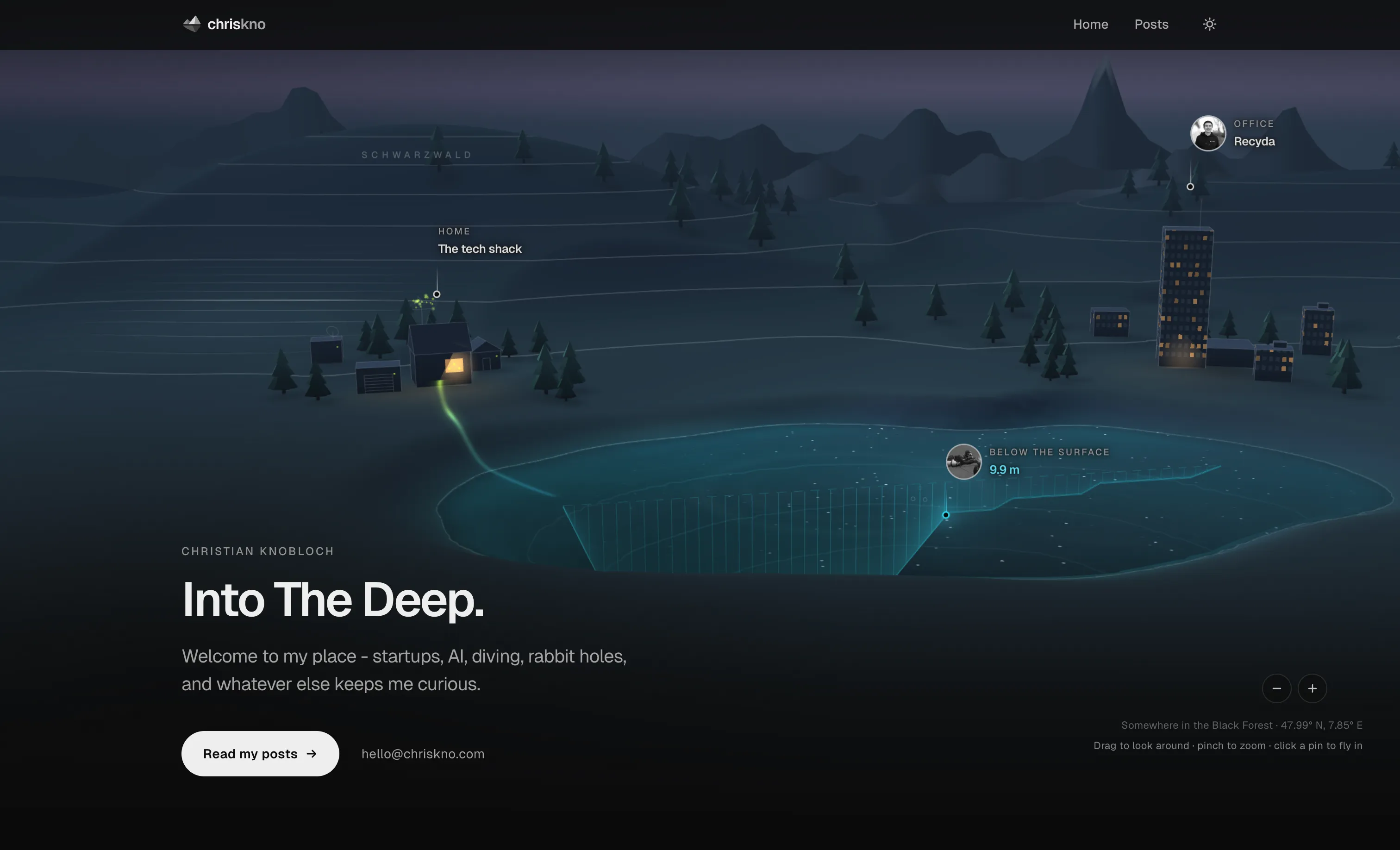
Night.
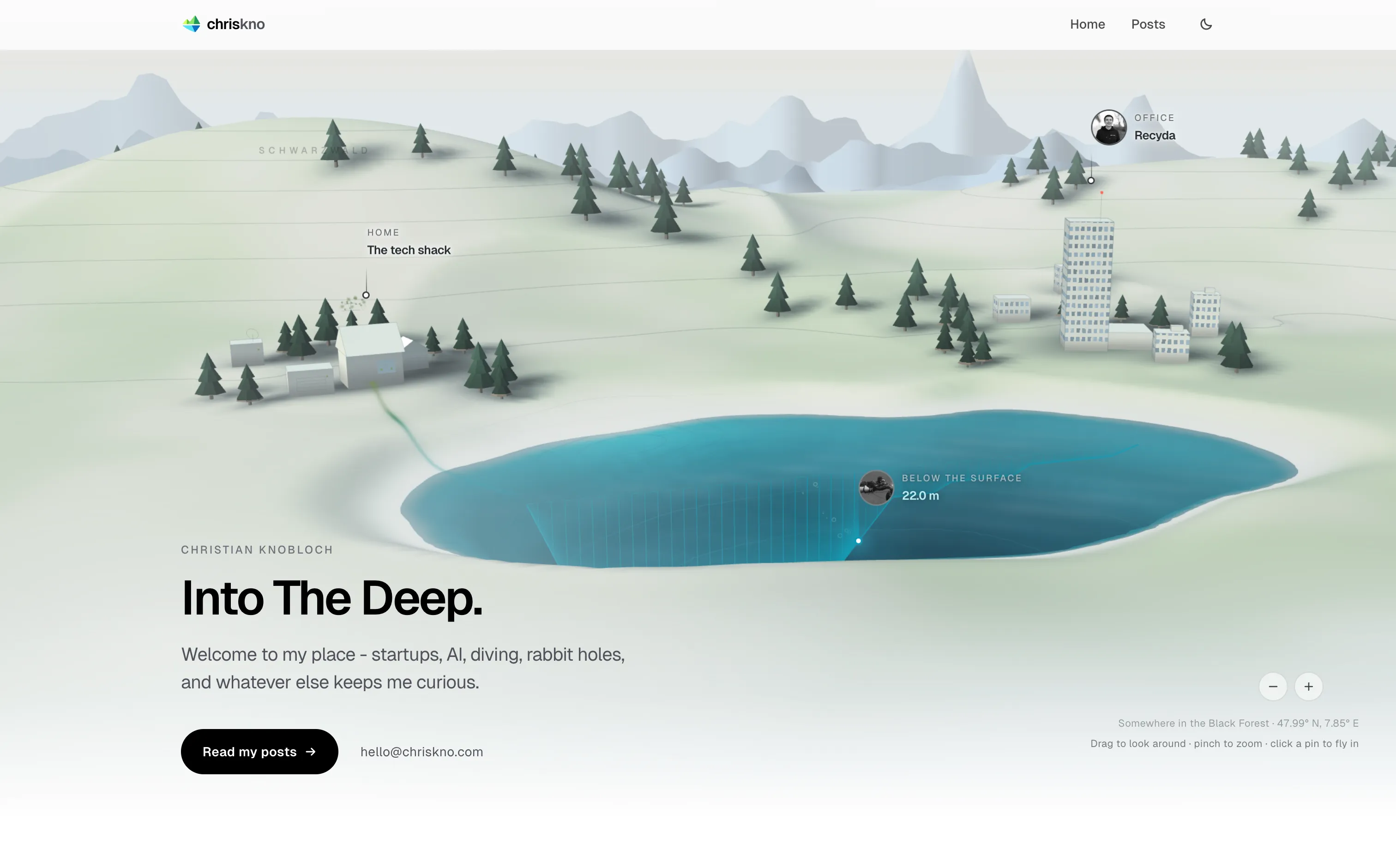
Day.
So much for a beautiful website being a few prompts away.
AI made almost every individual step easier. It could generate ideas, turn a rough image into a 3D scene, rewrite components, move trees around and happily try another version a few minutes later. But that doesn’t make knowing what you actually want any faster.
Most of those seven months weren’t spent writing code. They were spent looking at something, deciding it wasn’t quite right, and trying again.
I feel like with the latest frontier models we reached a point where - if we as humans provide a general art direction the models are INSANELY capable of building cool stuff.
Which is probably the main thing I learned from all of this: generating options is cheap now but you still need to give artistic direction.
Now I just need to actually write some posts.